GoCo's Reports help our clients gain more meaningful insights into their HR data, by utilizing filtering capabilities & the ability to create visual charts.
Custom Reports allow you to pick and choose exactly what data you want in your report to manipulate and visualize it directly in GoCo. You can create one-time reports or save reports to pull at any time. For each report, you'll -
- Define your Data
- Pick any data set, from workflows, performance, custom fields, employee profile data, and more. If it’s in GoCo, you can report on it!
- Organize your data
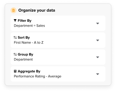
- Narrow down your data to the sections that matter most with easy filtering, sorting, row grouping, and aggregating.
- We didn't stop there! You can also apply basic functions to numerical columns like sum, average, minimum & maximum.
- Visualize & Analyze Trends
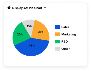
- GoCo now provides seven chart options to bring your data to life and easily identify trends. These charts include...
- Metric Charts
- Pie & Donut Charts
- Bar & Column Charts
- Line & Area Charts
- GoCo now provides seven chart options to bring your data to life and easily identify trends. These charts include...
To learn how to use filter your reports and create visual charts click here!
Need some examples of reports you can see yourself creating? Here are a few to get you started!
- Expense reimbursement by department
- PTO balance breakdown
- Company equipment issued breakdown
- Performance ratings over time
- Employee diversity breakdown
- Employee satisfaction
If you have any additional questions, reach out to either your CS Team or email us at support@goco.io 💚