When viewing your Custom Reports, you have a few filtering and customization options available to you, this article will cover the different tabs you'll see when creating. Use the links below to navigate within this article.
Basic Tab
In the "Basic" settings tab, Fields, Filters, & Schedule are options to expand and customize. Fields will allow you to select which columns you'd like to include in this report & Filters will allow you to select how to filter this data once selected. (To learn more about scheduling reports, click here 😉)

Fields
A few fields will auto-pull such as "First Name", "Last Name", & "Employee ID#" however you can add new fields to include in this report.
Once you hit the "+Add Fields" button a pop-out window will appear to search for & select any reportable field in GoCo. Once you've made your selections, hit the blue save button. 
Filters
Once you've made your field selections, you can customize how to filter this data. You can select from different team member groups & decide if you want to set perimeters around your fields. Note that you can also layer field rules. (Ex. filter by "Dietary Preference" equals "Vegetarian")

Advanced Tab
Grouping
- Decide how your data should be grouped here. You can select one or multiple Report Fields to group by.
- You can only choose the Report Fields you have already added in the Fields Section. Please note: The default here is that No Grouping is pre-selected.
- You can further group by using the "Additional Aggregation" section. This will come in handy later when we cover the visualization tab. If you have non-numerical fields, you can choose to aggregate them by count.
Show Dependents
- You can enable this setting to show Dependent information in a subordinate table.

Display
- This is where you will decide how the data should appear. The default selection is As of Today. This will show data as of the time you created this report.
However, If you want to see any other date, you will use the Time Machine. This presents a dropdown that allows you to select another date - other than today.
If I want to Show Changes Made, you'll choose that option here.

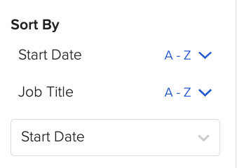
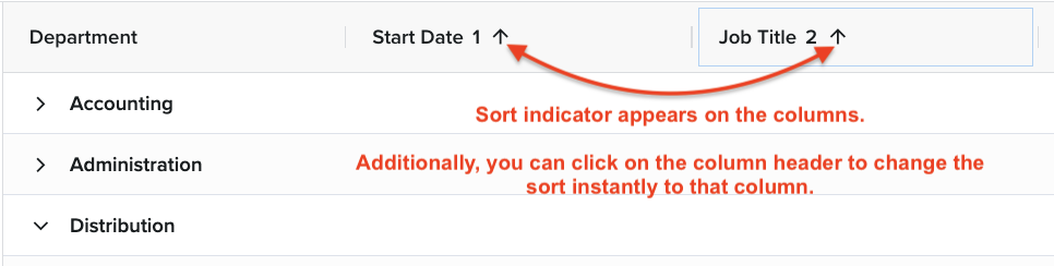
Sorting
Users can sort by any field in the report. You can choose to sort by one field or multiple fields.
Visualization Tab
- GoCo now provides you with seven chart options to bring your data to life and easily identify trends. These charts include...
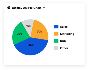
- Metric Charts
- Pie & Donut Charts
- Bar & Column Charts
- Line & Area Charts
- After clicking on the Visualization tab you will see several options appear below, click on the chart you wish to use.

- For the Bar Chart, Column Chart, Line Chart, and Area Chart, you will have options to set a filter for your "X-Axis" and your "Y-Axis".
⭐ Remember if the field you are trying to display is a text field & not a numeric field, you'll need to return to the "Advanced" tab after selecting your field type & add "Additional Aggregation" to convert that text field to a numerical one. Check out the video below for more information.
- Once your settings have been input the chart will appear on the right! Isn't it beautiful!? 🤩

- For the Pie Chart, Donut Chart, and Metric Chart your filtering options are "Displaying" and "Measured By".

Now that your report has been created, be sure to save it so that you can return to it at a later time.
Crash Course
Happy Reporting! 🤠
Have more questions? Contact support@goco.io.